
You can configure Themes by selecting the color, layout, font, and font size as per your preference. You can apply the configured theme to change the appearance of the Application.
To configure Themes:
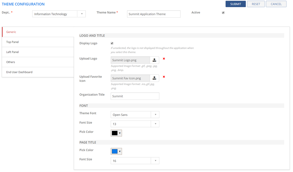
Figure: THEME CONFIGURATION : Generic page
The following table describes the fields on the THEME CONFIGURATION page:
| Field | Description |
| Theme Name | Type in the name of the Theme. |
| Active | If selected, the theme configuration becomes active. |
| Generic tab | |
| LOGO and TITLE | |
| Display Logo | The check box is selected by default. If you do not want the logo to be displayed throughout the application, deselect the check box. This is the logo you have added in the Upload Logo field. |
| Upload Logo | Upload a logo that you want to be displayed across the application. The supported image formats are .gif,.jpeg,.jpg,.png,.bmp. |
| Upload Favorite Icon | Upload a favorite icon that you want to be displayed across the application. The supported image formats are .ico,.gif,.jpg,.png. |
| Organization Title | Specify your Organization Title. |
| FONT | |
| Theme Font | Select the font that you want to appear on the application. |
| Font Size | Select the font size for the font you selected in the Theme Font field. |
| Pick Color | Select the font color for the font you selected in the Theme Font field. |
| PAGE TITLE | |
| Pick Color | Select the color that you want to appear on the title of a page. |
| Font Size | Select the font size for the title of the page. |
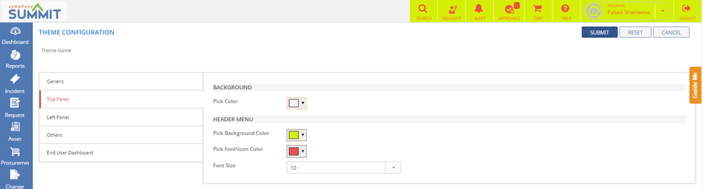
Top
Panel tab:  See
Screen shot See
Screen shot
|
|
| BACKGROUND | |
| Pick Color | Select the color that you want to appear on the background of the top panel. |
| HEADER MENU | |
| Pick Background Color | Select the color that you want to appear on the background of the text of the top panel. |
| Pick Font/Icon Color | Select the color for the font/icons that are displayed on the top panel. |
| Font Size | Select the font size for the font on the top panel. |
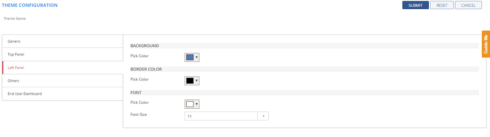
| Left
Panel tab: See
Screen Shot
|
|
| BACKGROUND | |
| Pick Color | Select the color that you want to appear on the background of the left panel. |
| BORDER COLOR | |
| Pick Color | Select the color that you want to appear on the border of the left panel. |
| FONT | |
| Pick Color | Select the font color for the text on the left panel. |
| Font Size | Select the font size for the font on the left panel. |
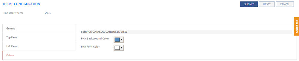
| Others
tab: See
Screen Shot
|
|
| SERVICE CATALOG CAROUSEL VIEW | |
Pick Background Color |
Select catalog tiles background color for carousel
view. See
Screen Shot.
|
Pick Font Color |
Select the color for the fonts that you want to display on the catalog tiles for carousel view |
End
User Dashboard tab: |
|
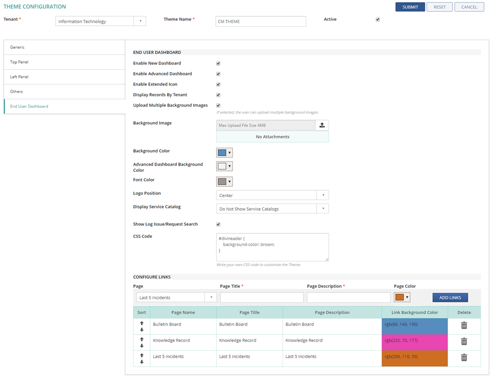
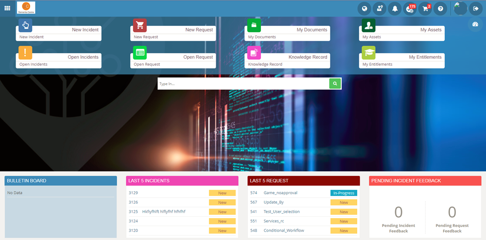
END USER DASHBOARD |
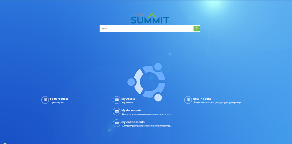
New End user Dashboard helps user to search and
navigate to the required page without using Menus and Submenus.
See Screen
Shot.
|
Enable New Dashboard |
Select the check box to enable New Dashboard page in place of traditional Dashboard page. |
Enable Advanced Dashboard |
Select the check box to enable Advanced Dashboard
page in place of traditional Dashboard page. |
Enable Extended Icon |
If selected, extended Icon design is enabled. |
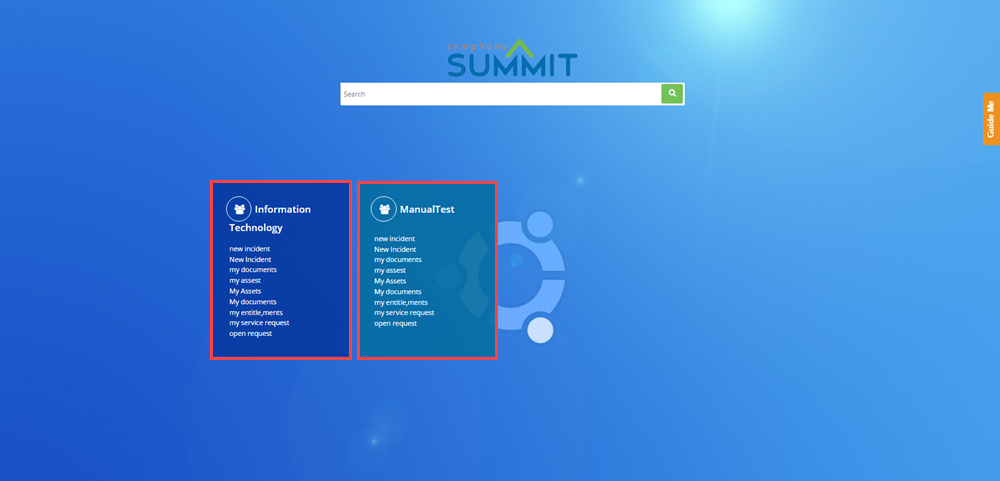
Display Records By Tenant |
Select By Tenant check box to categorise the tiles
by Tenant on the New Dashboard page. See
Screen Shot.
|
Upload Multiple Background Images |
If selected, the user can upload multiple background images. |
Background Image |
Click Upload button and select a background image for the New End User Dashboard. The supported image formats are .gif,.jpeg,.jpg,.png,.bmp. |
Background Color |
Select the color that you want to appear in the background of New Dashboard page. |
Advanced Dashboard Background Color |
Select the color that you want to appear in the background of Advanced Dashboard page. |
Font Color |
Select the font color for the text on the New Dashboard page. |
Logo Position |
Select the Logo Position from the drop-down list. You can select Top, Center, or Both. |
Display Service Catalog |
|
Service Catalogs |
This field is displayed only if you select "Select Service Catalogs Manually" in the Display Service Catalog drop-down. Select the required Service Catalogs from the drop-down list. |
Show Log Issue/Request Search |
If selected, the Log Issue/Request search bar is displayed on the DASHBOARD page, where the users can search for a specific keyword and log an Incident or a Service Request. |
CSS Code |
Specify the CSS code to customize the End User Dashboard themes such as fonts, colors, etc. This customization can be done in addition to the regular theme configuration. Note: Developer knowledge is required to use this feature. |
CONFIGURE LINKS |
|
Sort |
Click the up and down arrows, to sort the order. |
Page |
Select the page to be displayed on the New or Advanced Dashboard page. |
Page Title |
Specify the selected Page Title. |
Page Description |
Type in the description for the selected page. |
Page Color |
Select the color of the Page label to be displayed in the New or Advanced Dashboard page. |
ADD LINKS |
Click ADD LINKS to create link of the selected page on the New or Advanced Dashboard page. |
Delete |
Click  icon to delete the record. icon to delete the record. |