
You can add new Custom Fields using the Form Builder for the Users. These Custom Fields are places under the Custom Tabs (see: Configuring Custom Tabs).
To configure Custom Fields for Users:
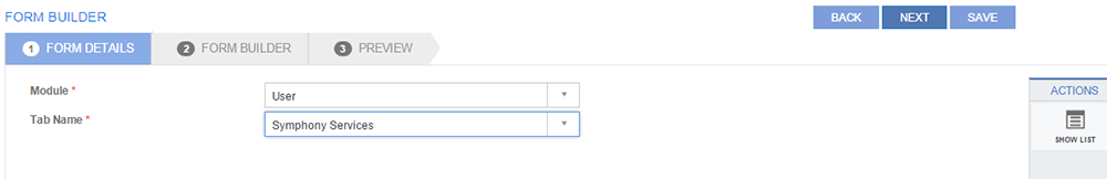
Figure: FORM BUILDER page: FORM DETAILS tab
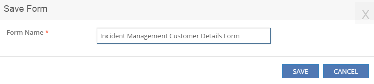
 See Screen Shot.
The saved Form is available under Form
Templates and can be re-used.
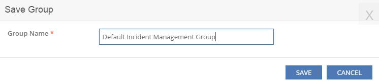
See Screen Shot.
The saved Group is available under Group
Templates and can be re-used. Click NEXT.
See Screen Shot.
The saved Form is available under Form
Templates and can be re-used.
See Screen Shot.
The saved Group is available under Group
Templates and can be re-used. Click NEXT.
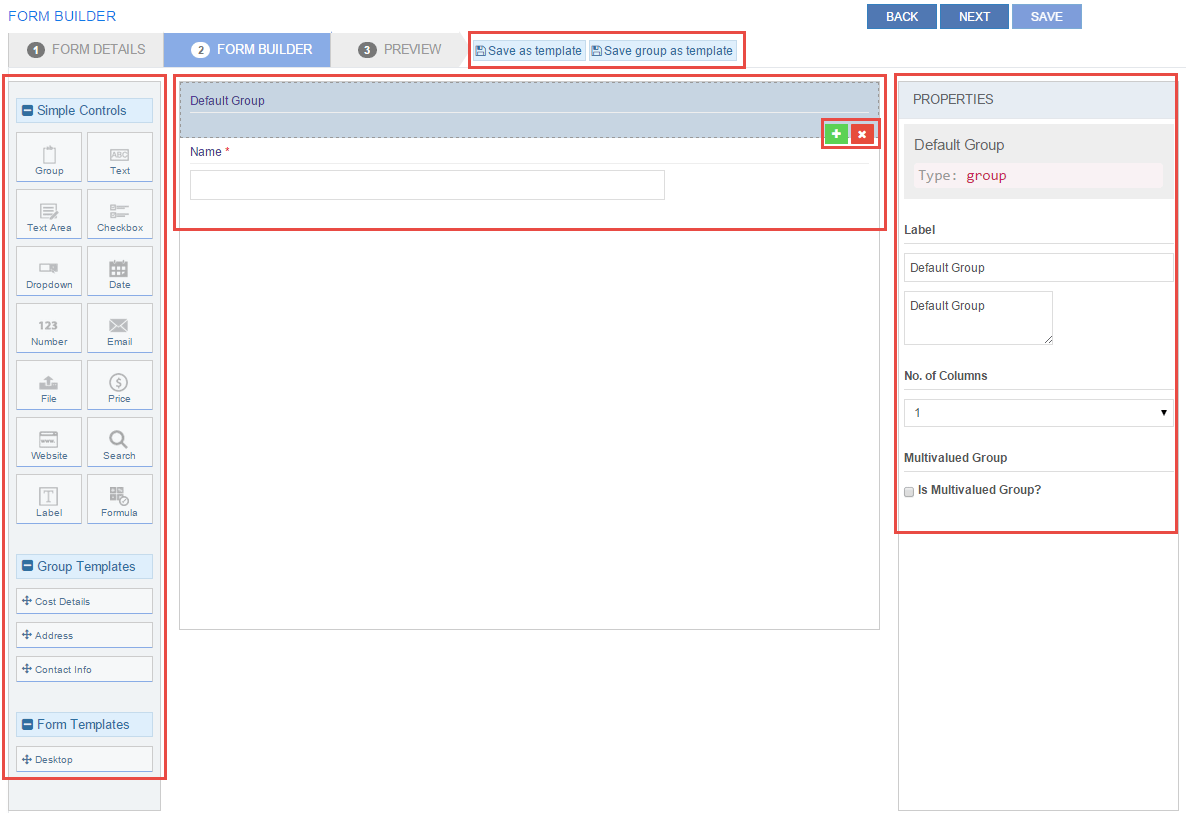
Figure: FORM BUILDER page: FORM BUILDER tab
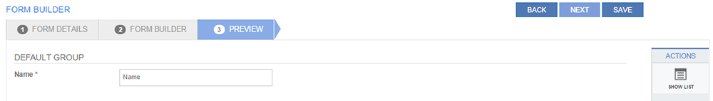
Figure: FORM BUILDER page: PREVIEW tab
The following table describes the field types and their properties on the FORM BUILDER page under the FORM BUILDER tab:
| Field | Properties |
| Group | Click Group
to create a group under the tab. Use this to group related fields.
Type in the required values for the following properties:
|
Text/ Text Area |
Click Text
to create a text box field. Click Text
Area to create a text
box field that allows more characters compared to text box field.
For example, for User Name, use Text
and for User Comments, use Text
Area. Text and Text Area
have the following fields:
|
Check Box |
Click Check Box
to create a check box field. Type in the required values for the
following properties:
|
| Drop-down | Click Drop-down
to create a drop-down field. Use this field to add an attribute
for which the user needs to select from multiple available options.
Type in the required values for the following properties:
|
| Date | Click Date
to add a date field. Type in the required values for the following
properties:
|
| Number | Click Number
to add a number field. For example, Maximum Approvals Required.
Type in the required values for the following properties:
|
Click E-mail
to add a field for entering e-mail ids. Type in the required values
for the following properties:
|
|
| File | Click File
to add a field where files can be added. Type in the required
values for the following properties:
|
| Price | Click Price to add a field where prices can be
added. For example, Project Cost. Type in the required values
for the following properties:
|
| Website | Click Website to add a field where website urls
can be added. Type in the required values for the following properties:
Label:
|
| Search | Click Website
to add a field where website urls can be added. Type in the required
values for the following properties:
|
| Label | Click Label
to add a field to label field. Type in the required values for
the following properties:
|
| Formula | Click Formula to add a field where a formula can be provided. For example, Average Cost. Type in the required values for the following properties:
|
| Group Templates | This section displays all the saved Group Templates. Drag and drop a Group Template to add a group of fields to the Form. |
| Form Templates | This section displays all the saved Form Templates. Drag and drop a Form Template to add a group of fields to the Form. |
This section explains all the icons displayed on the ACTIONS panel of the FORM BUILDER page.
SHOW LIST
Click SHOW LIST to display the LIST table showing all the configured Custom Fields for the selected Tenant.
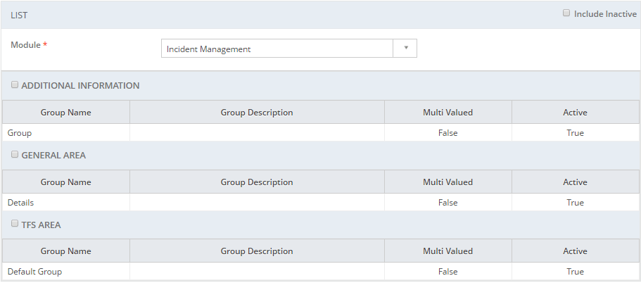
Figure: FORM BUILDER page: List of User Custom Fields
To display the inactive Custom Fields, click the Include Inactive check box.
| Note: When the Custom Fields are displayed under the LIST table, the ADD NEW action is displayed on the ACTIONS panel. Click ADD NEW to configure a new Custom Field. |
EDIT
Click EDIT to edit a Custom Field. Select the check box for the tab name whose Custom Fields you want to edit and click the EDIT icon.
To configure Custom Fields for Incidents, see Configuring Custom Fields for Incident Management.